Newsletter Subscribe
Enter your email address below and subscribe to our newsletter

 ByJohn A
You open a website for the first time. Before reading a full paragraph, you already have a feeling about it.
The page may seem professional, careless, safe, confusing, genuine, or suspicious. That judgment forms from many small signals working together.
A clear headline helps. So does a sharp image. A broken link, strange spacing, or vague promise can create doubt just as quickly.
Online trust is rarely built by one impressive feature. It grows when the details support the same message: this source is clear, careful, and worth your attention.
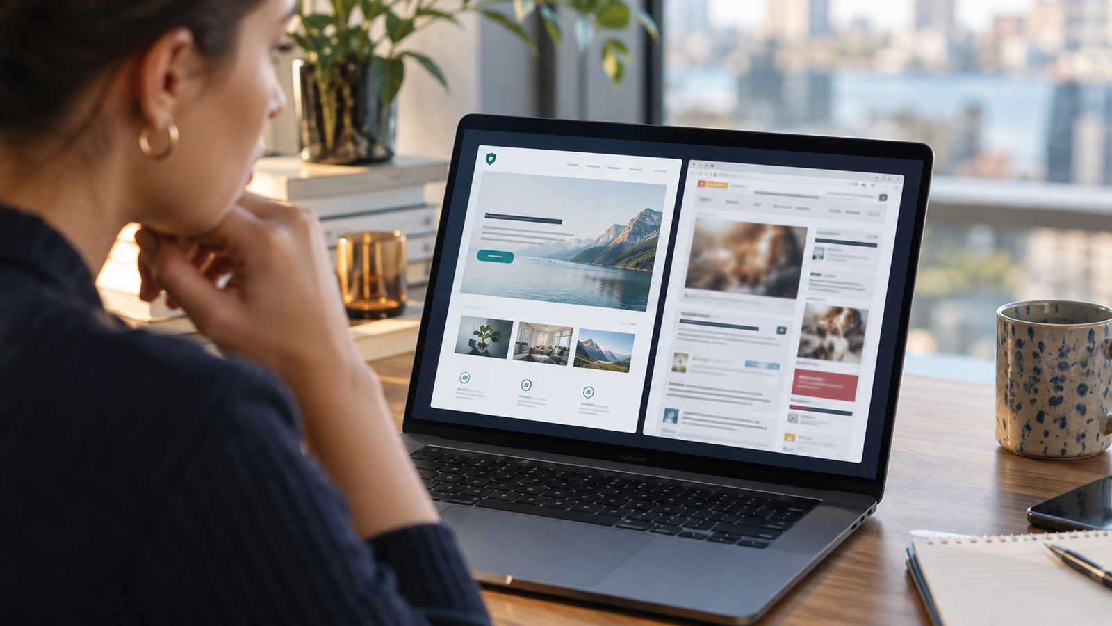
People often scan a page before deciding whether to stay. They notice the overall structure, color, imagery, and amount of effort required to understand what is happening.
A page does not need to look expensive. It needs to feel coherent. When headings, buttons, images, and words appear connected, the experience feels intentional. When they compete or contradict one another, people may hesitate.
That hesitation matters. A visitor who feels uncertain is less likely to share information, make a purchase, or rely on the advice provided.
Visitors should be able to answer three questions quickly: Where am I? What does this page offer? What can I do next?
Confusing introductions weaken trust because they create work. Long claims about being innovative or world-class offer little help if the actual service remains unclear.
A specific statement is stronger. Explain the product, audience, or subject in direct language. Then make the next step visible without pushing the visitor into an immediate decision.
Consistency helps people predict how a website will behave. Buttons that look alike should perform similar actions. Headings should follow a recognizable order. Contact details should match across important pages.
Small inconsistencies can feel harmless to the publisher but noticeable to a visitor. A company name written in two ways, an old logo in the footer, or prices that differ between pages can raise questions.
A consistent experience does not require every page to look identical. It requires shared rules and accurate information.
People are less comfortable with information that is difficult to read. Tiny text, weak contrast, crowded paragraphs, and distracting backgrounds increase effort.
Clear formatting creates room to think. Short paragraphs help readers follow an explanation. Useful headings show what comes next. Adequate spacing separates ideas without making the page feel empty.
Typography also changes tone. A playful style may suit entertainment content but feel misplaced on a legal or financial page. A traditional style may communicate authority but feel too formal for a children’s activity.
Try typing the same words into Fontalic, then switch between a few styles. The tone changes before the meaning does. That makes the comparison useful when choosing a headline or short display text, while longer copy should remain simple and comfortable to read.
A high-quality image can strengthen a page, but relevance matters more than polish.
A generic stock photo may look professional while adding no useful information. A real product photo, a clear diagram, or an honest view of the service can answer questions that words cannot.
Image quality also sends a signal. Blurry, stretched, or poorly cropped pictures suggest that other details may have been overlooked. Images should load quickly, display clearly, and support the surrounding content.
One typo does not make a website untrustworthy. A pattern of errors can.
Broken links, unfinished sentences, duplicate sections, placeholder names, and outdated dates suggest that nobody completed a careful review. These details are especially damaging on pages that ask for payment or personal information.
A final check on both desktop and mobile catches many problems. Test forms, links, menus, and buttons. Read important text aloud. Confirm names, prices, dates, and contact details against the original source.
Vague claims are difficult to evaluate. Words such as “best,” “leading,” and “guaranteed” often create more doubt than confidence when no evidence follows.
Specific information is more useful. Explain what a service includes. Show how a process works. State important limits. Use real examples when permission allows.
If a result varies, say so. Honest boundaries can increase trust because they show that the writer understands the difference between useful guidance and an unrealistic promise.
Readers want to know who is behind important information. A useful About page, working contact method, author details, and clear company information reduce uncertainty.
This does not mean every website must publish personal details. The level of identity should fit the subject. A personal blog may include an author biography. A business may show its location, service area, and support options. An informational site may explain its editorial process and sources.
Accountability becomes more important when content affects health, money, safety, or legal decisions.
See also: Old Gmail Accounts for Sale: A Buyer’s Safety and Compliance Guide
A polished design cannot replace basic security. A secure connection, reputable payment process, clear privacy information, and sensible data requests are practical requirements.
Visitors should understand why a form asks for information and what will happen after submission. Request only what is necessary. A simple contact form should not demand unrelated personal details.
Avoid decorative security badges that cannot be verified. Real protections and plain explanations are more persuasive than a row of impressive-looking icons.
Reviews, testimonials, case studies, and customer examples can reduce uncertainty. They show how other people experienced a product or service.
But social proof must feel authentic. Extremely broad praise, repeated wording, missing context, and stock portraits can have the opposite effect.
A believable testimonial explains the situation, the help received, and the outcome in natural language. Case studies should include enough context to be useful without exposing private information.
Design can make a trustworthy message easier to understand. It cannot make weak or misleading information reliable.
The strongest pages align presentation with substance. The headline matches the content. The image reflects the subject. The call to action matches what happens next. The details can be checked.
This alignment creates confidence because nothing feels hidden or out of place.
Before publishing, look at the page as a first-time visitor.
Can you identify its purpose within a few seconds? Is the most important information easy to find? Are the words readable on a phone? Do images support the content? Are claims explained or supported? Do all links and forms work? Is it clear who created the page and how to contact them?
These checks are simple, but together they shape the experience.
People rarely trust a website because of one badge, one review, or one beautiful image. They trust it when many small details point in the same direction.
Clear language shows respect. Consistent design suggests care. Accurate information demonstrates responsibility. Working features prove that someone is paying attention.
Each detail may seem minor on its own. Together, they help a visitor decide whether to stay, believe, and act.